The Padre review
I love a good, old fashioned horror game. Fixed camera angles, low resolution visuals and zombies, or strange creatures at the very least. The Padre, from indie developer Shotgun With Glitters, ticks all of the boxes above, albeit with a few caveats. For example, its low resolution visuals are actually voxel-based, appearing blocky and pixelated instead of actually being 640×480 resolution stretched out to 720/1080p.
The voxel visuals make everything look like 3D pixels, giving The Padre a very stylised look similar to that of the overlooked 3D Dot Game Heroes on PS3. There’s more complex lighting and some excellent FX on show however, bringing this new game into a more modern generation, but it also pays a bit of a hefty toll on the Nintendo Switch. Whether played in handheld on docked, The Padre runs poorly at best, at worst it’s a slideshow.
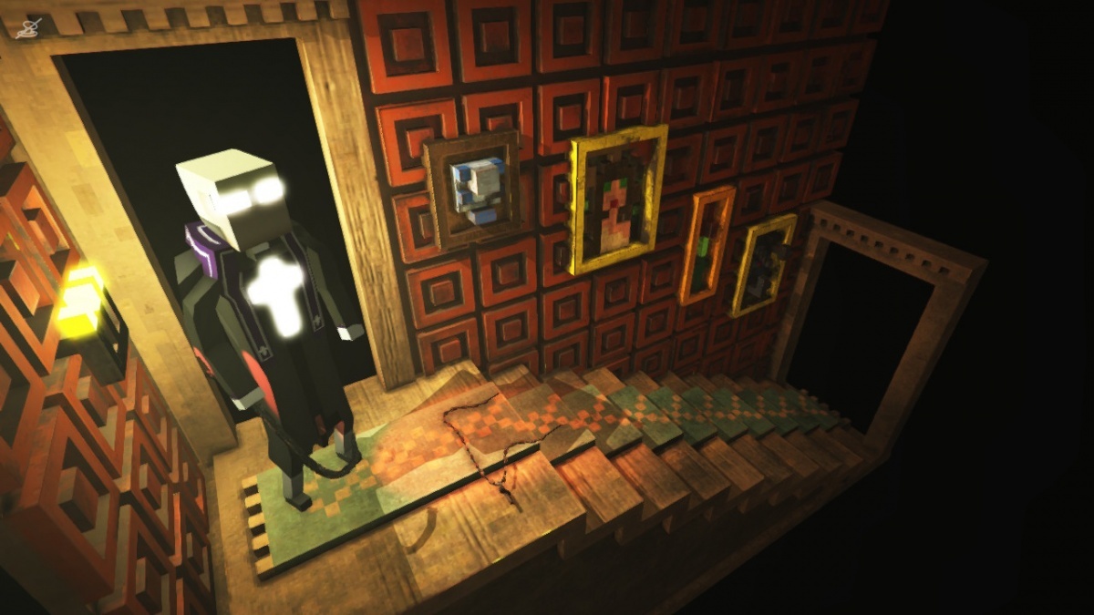
As mentioned earlier, The Padre is an old fashioned horror game, albeit not entirely serious. There’s an underlying snark, as the game parodies the likes of Resident Evil and even references Dark Souls, but the gameplay itself is very similar to Alone in the Dark with its more melee-focused combat (guns do become available later).
You might be wondering why a man of the cloth is wielding a crowbar (named Gordon, no less) and guns, but it turns out he’s a bit of a demon hunter. However, he doesn’t bother raiding his closet full of guns for his latest mission, as it only involves finding his old mentor, Benedictus. Bad move really, as it turns out the mansion where he was last seen is actually full of zombies and all kinds of paranormal weirdness. Once you scrounge together a few weapons, combat is simply a case of using ZL to block/aim, with ZR used to attack/shoot, and the enemies mostly consist of slow-moving beasties that often pose no real threat. That said, they can respawn at random and, now and again, have been known to attack before the room has fully loaded up. Very frustrating, especially if you’re low on health.
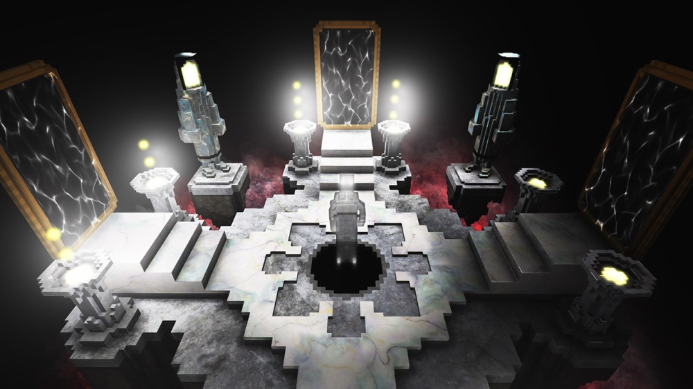
You see, The Padre has an interesting mechanic, with every death adding a few angel’s tears to a mysterious vial in your pocket. Fill it completely and you’ll lose all your progress, so when there are puzzles (and even inventory items) that can instantly kill you without warning, this feature becomes more and more inconvenient. There’s no real explanation for it either, which actually makes sense given that nothing in the game is explained. This is a huge issue when it comes to quite obtuse puzzle design, often without any clues given. Some do have environmental cues or vague clues via some obscure text, but most of the time I found myself getting stuck. I even had to reach out to the developer at one point, as I couldn’t work out where to go or how to solve the puzzles I was currently tearing my hair out over.
Frustration is the overriding feeling I got throughout The Padre. Frustration at the awkward control scheme, which uses seemingly random contextual button presses to pick up items and activate switches. If there are several interactables nearby, a different button icon will appear over each thing, but often the X, Y and A prompts will switch around, and this lack of consistency resulted in many a wrong button pressed. Frustration would also rear its ugly head when another puzzle provided a stumbling block, or another bug got the padre stuck on a piece of furniture or, in one particular case late on, stuck in a place that meant I literally could not progress. Having to quit the game and reload the save, wiping all progress in the room you were in is, yep you guessed it: frustrating.
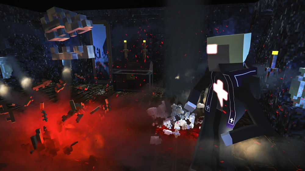
But you know what’s most frustrating about all this? The Padre is actually a good game. Or rather, it would be if there were more direction and a bit more polish. Input lag and a poor framerate mar the experience on Switch, and when your progress in the current room is essentially wiped by a bug for the umpteenth time, you cannot help but want to switch the game off and never return. I really wanted to like The Padre, and at times I honestly did, but sometimes it felt like I was banging my head against a brick wall, something that could easily be avoided if the game offered a little more help in solving its cruel puzzles.
