DESYNC Review
Back in the 80s and even the early 90s, our perception of what the virtual world was actually like and how it was visualised was very much marked by the popularity of Tron whilst being accompanied by a soundtrack of synth awesomeness. This perception of the virtual world persisted through to the 90s too, with films like Hackers still employing what we now call a ‘retro’ vibe.
Recently a lot of games have moved back to this aesthetic style deliberately to trigger this feeling of nostalgia many of us in the older spectrum of gaming will eat up. By and large this is a welcome tidbit of nostalgia, but there comes a point when this aesthetic style becomes a crutch that is used to lean on heavily rather than a means of accentuating an already great game with a retro visual.
To preface a little, while I have many issues with DESYNC these are personal quirks and design choices that I find detrimental. The basis and concept of DESYNC works and actually can be a lot of fun, if you’re willing to look past certain fundamental aspects of the game.
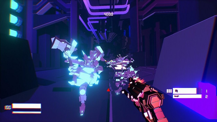
DESYNC is an intense wave-based shooter with a retro Tron-like feel of dark spaces highlighted by bright neon colours. Each wave introduces a new set of enemies, or an enhanced version of an enemy you’ve vanquished previously with an array of attacks that you will have to find ways around. There is a spread of melee and projectile attacks that you will need to be on the lookout for and a brutally accurate AI that will lead every shot in the direction that you’re heading. DESYNC boasts a difficulty that will test your first-person shooter skills and punish you for mistakes made. I love the style, soundtrack, and the premise of the game and I found the arenas to be a gorgeous representation of the 80s idea of what a virtual world is. The only visual element I didn’t like was the intermittent scan lines and flickering effect that the game imposes on you, but this quickly becomes unnoticeable and bearable.
What DESYNC has in aesthetic it sorely lacks in other areas, though. The menus are terminals that can be interacted with in the hub, the place where you select your map, and serves as a means to upgrade weapons and equip special ultimate items to your character. These, unfortunately, were a little cumbersome to navigate and offered little in the way of explanation of how to use certain upgrades or even what they do. A little more embellishment on this side of things would not have gone amiss.
The setup of the levels means that every one you complete will unlock the next one, and after three you will open up a boss fight. The design of each map is a series of arenas that will spawn enemies when you enter the trigger area, simultaneously sealing off all exits. Usually these rooms are symmetrical with traps dotted around to lure enemies into, but the most annoying part I found to this design was that the enemies wouldn’t trigger the traps by walking too close to them. Rather, you would have to use a weapon with a substantial kick to it to push enemies into them. After a few levels, though, the number of enemies that can be pushed into traps becomes incredibly limited.
That said, the selection of weapons available was pretty decent and I really liked most of them – including the first weapon – for their variety. They felt pretty good to handle and using the right weapon against the right foe was rewarding. Ultimately, though, you will likely use your most powerful wherever you can until you run out of ammo for it and step down to the next one on the list. This, at least, was what I found after a while as it was generally the easiest way to handle most encounters.
I’m unsure whether it was due to the design of the maps, the lack of a decent jump, or just through my own failures that I got caught on geometry quite often, but this was a large factor in the growing frustration. It was incredibly easy to become caught up and unable to make a hasty retreat, even with a dash move at your disposal, that always led to taking a massive chunk of damage from an extremely punishing attack. Enemies with melee attacks have a huge reach and often you’ll find that what you thought was the edge of their attack range is in fact the middle of it, and it doesn’t help that as soon as you’re within that range there is no grace period of a winding-up of attack animations. It’s a pretty instantaneous swipe or whomp that leaves you pretty much done for. This becomes a fairly punishing combination when five or six enemies are spawned all over the map and constantly converge toward you.
I am absolutely no stranger to difficult challenges in games and will often relish the opportunity to play something that’s meant to be crushingly difficult; however, there is a big difference between challenging design and artificially punishing. Enemies are unforgiving in their attacks with little or no visual representation of an impending attack, and an almost unfair tracking of projectile attacks that adds a level of frustration which takes away from the experience. Instead of being motivated to improve on your previous attempt and try again, it instead creates a frustration, and often it’s difficult to know what you did wrong – if anything at all.
While this may sound very negative, the game does have a lot going for it and could be really, really awesome fun. It harks back to the yesteryear of classic Doom and Quake games, but just falls a little short. I wanted this game to be awesome!
There is definitely hope. All of the gripes I have with the game that marred the experience is on the surface level of balancing. With a few tweaks to the mechanics and a few fixes to even out the game from insane levels of punishment and create a fairer environment, it could be a solid must play title.


