Welcome to your New Look GodisaGeek
You may have noticed something a bit different as you look around the site today, because we’ve had a major redesign, ushering in what we’re calling GodisaGeek 4.0.
Over the past years, we’ve always kept one core belief here, and that’s to put the reader first, and we believe that this new-look site does exactly that, while also giving us the scope to achieve our ambitions for many years to come.
You see, eventually, we plan to be your one-stop location for entertainment, and not just video games. While our fundamental ideals of delivering the best game content we possibly can, will always be applicable, we want to branch out into other areas, bringing in our music and movies (and more) reviews and coverage in the future. Don’t get scared, we’re not going to start bombarding you with content you don’t want to see, this new design is so highly customisable, we can tailor content to a degree we’ve never been able to before.
Starting with videos. Sure, there’s a lot of people out there who love to read our waffle accompanying a video, or the latest trailer released. But others, well you just want to watch the video and move on to the next piece of content. We hear you, so we’ve made videos watchable from the home page. See a trailer you want to watch, then watch it. Want to reward our hard work with a click? Click through and read the information that comes with it. It’s your choice.

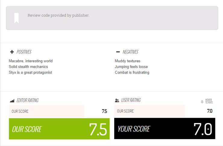
Reviews have had a kick up the rear, too. We’ve introduced a positive and negative section, as well as an “in short” section, for those of you who cheekily skip to the end of the review anyway. But we’re never going to do away with longform reviews, or articles. Most of our staff enjoy writing, and want you to read their in-depth thoughts on the subject. You’ll notice, however, that you can now give us your score on the game. Hover over that, and a simple slider appears. All those scores are collated into a community score, because we want to know how our thoughts compare to yours. A review is not the end of the discussion here, it’s the beginning of a new one.
That’s something vital to us, too: communication. We aren’t some almighty-uber journalists (most of us don’t even use that word, except for when referring to Colm, because he does real journalism), we’re gamers, and we want to talk to you (not at you), and hear your thoughts. Please hit up the comment section, and hit the “heart” icon to like an article. Your input helps propagate the site elsewhere, those likes translate into a chart, telling everyone what the most popular articles are – and helping us make sure we’re creating what you want to see.
The new site should be fully compatible with any mobile or tablet device you use, too. We know we’ve been guilty of letting the side down there, so hopefully you can browse from wherever, whenever, now. One thing that always bugged me was trying to comment via mobile. Disqus would log me out, then mess up when logging in. It doesn’t do that any more, thank heavens.
![]()
Some other small things to note, then. The three lines you see next to our logo is a drop down for game reviews, it’s not that clear right now and we may change that in the future. The number you see that you can click, is the amount of new posts since your last visit, click it and you’ll see those articles.
While I do believe a review is a singular writer’s opinion, on this I can speak for the entire staff of the site, current and future: this site is for the readers. So please, give us feedback on what you think so far, but know that a lot of features will roll out over the coming months.
We can’t all agree on everything, but most of all, know that all the staff here do what they do because they love it, so say hi to them on the staff page.


