The good (and bad) of The Surge 2 so far | Preview
The Surge was a strange one. It had great ideas and a fantastic setting, with lore that felt rich and deep. It was a Souls game that tried something a little different, eschewing the usual fantasy setting for a full sci-fi story with robots and everything. Unfortunately, new ideas and a change in scenery wasn’t enough, and The Surge came undone a little because of its combat issues and over complicated level design. It felt like a game that needed a sequel to iron out its flaws.
But does The Surge 2 actually do anything to rectify the flaws of its predecessor? I sat down with a preview build, to find out. Here are just some of the things that have improved:
There’s a character creator!
This always bothered me about both of Deck13’s Soulslike games. Both Lords of the Fallen and The Surge forced you to play as generic dudes, which often removes a sense of immersion for me. I like to roleplay (oo-err and all that) and a big part of that is creating my own character, regardless of whether I go male or female.
Upon starting The Surge 2, I was incredibly happy to discover a fairly robust character creator waiting for me. You can choose male or female, then pick a set face before editing it to suit your preferences. It may seem like a small thing to some, or you might not care at all, but it was a hugely appreciated addition and proves that Deck13 listened to player feedback.
More story and proper NPC interaction
Again, while The Surge offered a really interesting setting and provided plenty of lore, its actual storytelling felt lacking. I never felt like I understood why I was doing anything in the original game, but this sequel appears to have taken that into account.
While not much is given away during the preview chunk that I played, I did enjoy trying to piece together the story of Jericho City and its inhabitants, as they come to terms with the aftermath of the “CREO incident” of the original game. This was made better by the introduction of a more NPC-laden setting, from which you can learn about the world and receive quests. One area is a non-combat hub in which you can speak to survivors and even do a little shopping, all of which helps to create a more interactive game world.

There are even proper cutscenes, though the good thing about them is that they all take place as you play. No stopping and starting the gameplay, simply hold the X button (I was on PC, using an Xbox One controller, it will probably be Square on the PS4) if you want to zoom in on what’s happening, otherwise you can simply watch from where you are. Even better, if there is a scene introducing a boss for example (two of which I saw during this preview), the scene will only happen on the first encounter. There’s none of the infamous “lookit all dat juice,” stuff in The Surge 2. Well, at least not in the preview, hopefully that will continue into the full game.
It’s much brighter and more colourful
While it made sense that the CREO facility in The Surge was full of dull greys and blues and a distinct lack of lighting, it still made for rather dark and samey environs. Even the enemies were often dull metal things and it simply wasn’t particularly colourful or varied.
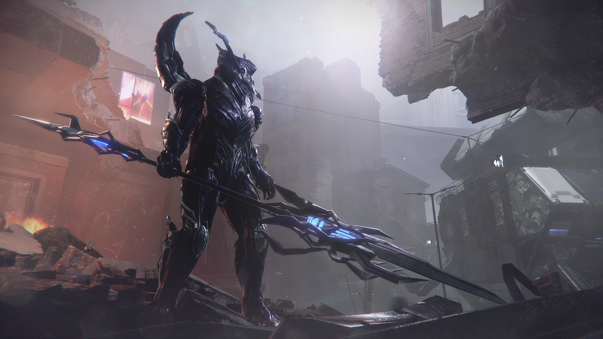
Although the beginning of The Surge 2’s preview was set in a (very) dark prison, which initially had me worried, I soon found myself out in the daylight, looking down on a city that seemed to have a fair amount of life and character. There’s even a building shaped like a giant squid, which instantly gives the sequel more character than the first game.
I spent a lot of time exploring the first few areas of the game, taking in the sights and sounds of the largely abandoned city. It’s surprising just how far a little daylight goes, bringing out the colours of a game’s world and just making for a more interesting place to wander around. Even if you are trying to avoid being murdered.
Improved combat
Avoiding said murder is a lot easier this time around, thanks to some much-needed improvements to the combat system. I’m not going to sit here and tell you that everything has been magically fixed, as enemies can still completely ignore your attacks and hit you through your attack animations, but it’s far less of a problem in The Surge 2.
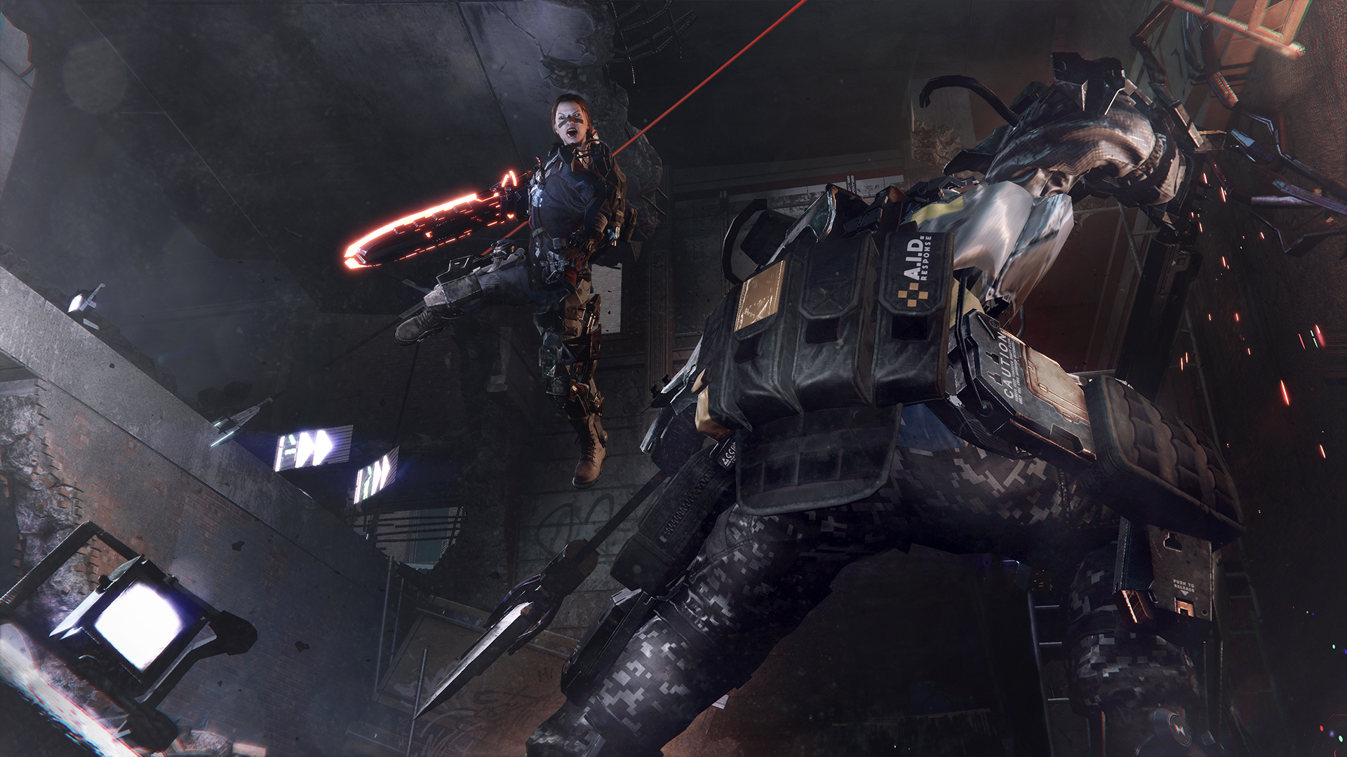
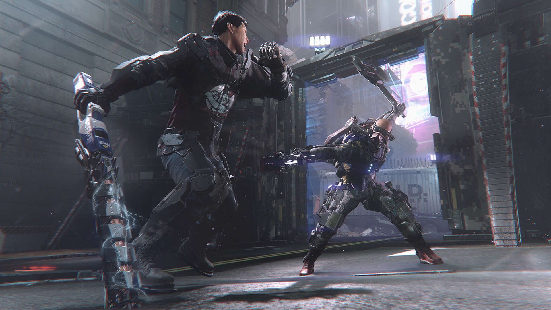
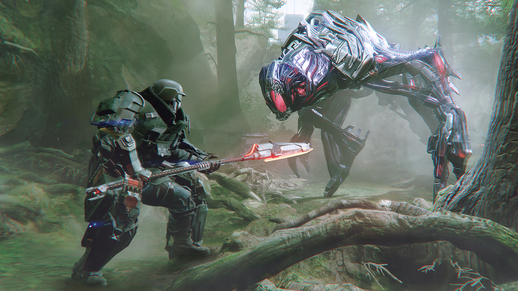
This preview pitted me against mostly human enemies this time around, each sporting different amounts of exoskeletal armour and a surprising variety of melee weaponry. Much like the first game, you can target specific body parts to either do more damage to unarmoured areas, or to weaken armour before slicing it off in a Mortal Kombat-esque fatality sequence. Cutting it off results in picking up schematics to build your own versions of the armour or, if you cut off the arm that wielded a weapon, you’ll pick up pieces that you can use to build and upgrade your own weapons. It was a great system in the first game, but here it’s just improved nicely.

For the most part, fights felt far more balanced, with enemies telegraphing their attacks a little better. This didn’t make it easy at all, but it does help to stop you from being sucker punched all the time, like in the first game. Enemies will also stagger a lot more, depending on what weapons you use and what body parts you target. For example, one guy used a car door as a shield and it prevented me from getting any decent attacks in, but hacking at his unarmoured leg would stagger him, allowing me to get around his shield. It’s simple, but it’s greatly appreciated.
I didn’t like everything about The Surge 2, however. Some issues were simply down to there being bugs and glitches in this preview build, which is to be expected for a game that is still two months from release. Some issues though, were down to gameplay and design issues that simply didn’t sit well with me.
Combat issues
While the combat has improved quite a lot, it was certainly disappointing to find that Deck13 hadn’t really fixed some of the biggest issues of the previous game. As I mentioned earlier, it’s disappointing to find that you can still be mid-combo and your opponent can simply ignore what you’re doing and stab you in the face. It’s less of a problem here, but it’s still hugely annoying when you die because an enemy seems completely immune to a scythe across the chest, or a hammer to the head.
Enemy placement is still a problem, too. Like in the previous game, one-on-one fights are fine, but once you’re up against two or more opponents, it’s near impossible to survive without sheer luck. Annoyingly, like the first game, you’re often ambushed by several opponents at once and when they can kill you in one or two hits, it’s incredibly frustrating. Combine that with them hitting you through your attack animations and you’ve got the recipe for another deeply flawed experience. Hopefully Deck13 will use some of the next two months balancing these things a little.

Time limits on lost XP
You die in The Surge 2. It happens, you learn from it and move on. The thing is, like Lords of the Fallen and The Surge, you only have a limited amount of time to retrieve the scrap that is dropped upon death, and that can be a real problem. Sometimes there are long periods between med bays (the checkpoints of The Surge 2, used to upgrade and level up, at the expense of reviving all dead enemies) and it leaves you with very little time to retrieve what you’ve lost, especially if you’ve already had a tough time getting to where you eventually died.
I’d hoped that this needless, extra challenge would be removed from The Surge 2, but my hopes were in vain. I know it’s a design choice for Deck13’s games, but it has always felt like an extra step to set it apart from the Souls games, rather than something that genuinely benefits the overall experience.
Over-complicated level design
Yes, I enjoyed my time exploring Jericho City, but I often found myself struggling to work out where I was in relation to med bays or objectives. Even though Deck13 was kind enough to put maps around the city, it didn’t help when I was already struggling with the twisty, claustrophobic back alleys and almost hidden doorways that were needed to progress.

Whenever I found a route back to the last med bay, it would be a complete surprise. The level design is so twisty and busy, that I could never get a read on where I was, at least not until I’d repeated a section again and again, usually because of a particularly irritating enemy encounter.
Look, I know this may sound a bit petty, but a game like this needs level design that the player can remember. Even with a giant squid on the map, I found myself struggling to work out which was the way to go, and it sometimes made progression feel more of a grind than is necessary. Hopefully it’s only an issue for the first few areas, but I guess we’ll just have to wait until September to see if the rest of the game feels less clumsy to explore.
The Surge 2 is certainly shaping up to be an improvement on the previous game, despite still making some of the same mistakes. I found myself wanting to keep going back, to see if I could beat that enemy or to see if I could iron out the flaws in my run through that area, which is already ahead of my feelings about the original. Deck13’s games feel like they need a sequel to get things right, and perhaps The Surge 2 may prove that.


