Thomas Was Alone iPad Review
Originally released back in 2012 on PC, then on PlayStation platforms a year ago, Mike Bithell’s puzzle-platformer, Thomas Was Alone, has now arrived on iPad. This collection of squares and rectangles probably feels a bit more loved by now as Thomas’ reach has grown quite a lot in two years. But now, there’s a chance to get a whole new audience on board.
Last April, we reviewed Thomas Was Alone on PlayStation 3 and PlayStation Vita, so to drone on about the mechanics, puzzles, or story again, would be pointless. In that department, naturally, nothing has changed. This is a straight-up port, but one that subtly utilises the iPad’s advantages.

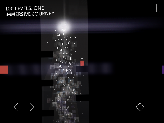
As with most ports to mobile/tablet, Thomas Was Alone’s default control method is on-screen buttons. Arrows denoting left and right sit in the bottom left-hand corner, with a single button on the right of the screen, which is used to make Thomas and his merry band of polygons leap. As with all mobile titles, you lose the tactile feel of pressing “X”, or “A”, for example, so the fact that you don’t have to be precise here, is a Godsend. Pressing within approximately an inch of any of the buttons will give you the desired outcome. Thomas doesn’t ask you to be pin-point, or alert with your jumps, on most occasions, so giving a bit of leeway is the right move.
Alternatively, there is another option when it comes to controlling these multi-faceted shapes. Imagine your iPad is split into four quarters (top-left, top-right, bottom-left and bottom-right) and there are no virtual buttons on-screen. If you place your thumb anywhere within the imaginary bottom right quadrant, you’ll make your character jump. Similarly, if you place your left thumb in the bottom left quadrant, you can move your character left and right with directional controls that weren’t present before you put your digit on the iPad’s screen. This may be more appealing to people who aren’t well versed with controllers, but it’s far more awkward moving Claire, James, or any of Thomas’ buddies around any one of the 100 stages. There’s a fine line between the forgiving nature of the default control scheme, and this practice, which is far too loose.

Switching characters couldn’t be simpler, though. On the edges of the screen there will be coloured bars, relating to their respective blocks. By tapping on the yellow bar, for instance, you’ll be in control of John. It’s fluid, easy, and most certainly the best implementation of character switching in any of the Thomas Was Alone incarnations.
VERDICT: Not much has changed, but that’s a good thing. To tamper with the formula would be doing a disservice to the great work that first came to people’s attention, two years ago. If this gets the lonely quadrilateral in the hands of more folk, then that’s a good thing.

VERY GOOD. An 8/10 is only awarded to a game we consider truly worthy of your hard-earned cash. This game is only held back by a smattering of minor or middling issues and comes highly recommended.
Review code provided by publisher.


